How to Create Fully Functional Custom Network Maps in Zabbix 7.4 (Step-by-Step Tutorial)
Table of Contents
Introduction
Zabbix maps vs dashboards
Step 1: Ensure devices exist in Zabbix
Step 2: Create a new network map
Step 3: Add devices to the map
Step 4: Connect devices using links
Step 5: Organize infrastructure zones
Step 6: Configure dynamic icons
Step 7: Use trigger-based labels
Best practices for Zabbix map design
Zappix map design checklist
Benefits of network maps in Zabbix
Final thoughts
Introduction
Network monitoring tools provide large amounts of technical data, but visualizing infrastructure makes it far easier to understand the health of a network at a glance. One of the most powerful visualization features in Zabbix 7.4 is the ability to build custom network maps that display devices, connections, and real-time problems directly in a topology diagram.
In this tutorial, we will walk through how to create a fully functional custom map in Zabbix. The goal is to create a map that visually represents the infrastructure being monitored and dynamically reflects network health using triggers, icons, and link indicators.
Zabbix maps vs dashboards
Zabbix provides multiple ways to visualize monitoring data, but two of the most commonly used tools are dashboards and network maps. Although they may appear similar at first glance, they serve different purposes.
Zabbix dashboards
Dashboards are designed to display metrics, graphs, and aggregated monitoring data. Typical dashboard widgets include:
- Graphs
- Problem summaries
- Top hosts
- SLA widgets
- Trigger lists
Dashboards are ideal for operational monitoring and performance analysis. For example, a dashboard might show:
- CPU usage across servers
- Network throughput
- Active problems
- System availability
Zabbix Network Maps
Network maps focus on visualizing infrastructure topology. They allow administrators to:
- Display network devices
- Connect devices with links
- Show real-time problem states
- Represent physical or logical network layouts
Maps answer questions like:
- Which device is causing an outage?
- Which switch connects to a server?
- Which part of the network is affected?
For infrastructure teams, maps act as a visual troubleshooting tool, making it easier to identify root causes quickly. In this tutorial, we will take you through the steps required to create a fully functional custom map in Zabbix.
Step 1: Ensure devices exist in Zabbix
Before creating a map, all of the devices you want to display must already exist as hosts in Zabbix.
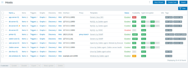
Navigate to: Data collection → Hosts and you should see the hosts that will appear on the map. Each host should have:
- A configured interface (agent, SNMP, etc.)
- A monitoring template
- Active triggers
Triggers are important because maps rely on the trigger status to display problems visually. For example:
- A Linux server might have a trigger for “Zabbix agent not available.”
- A Windows machine might alert when a service is not running.
- A firewall could trigger on packet loss or interface status.
These triggers will automatically change the appearance of map elements when a problem occurs.
Step 2: Create a New Network Map
Next, create the map itself. Navigate to: Monitoring → Maps then click Create map. When creating the map, configure the following recommended settings:
- Name: Example network map
- Width/Height: Large enough to display the full topology
- Background image: Optional but useful for structured layouts
- Icon mapping: Enable if you want dynamic icons based on host status
Once saved, Zabbix will open the map editor interface.
Step 3: Add devices to the map
Now we can begin constructing the topology.
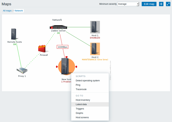
If a device shows red i.e. has a red halo around it then you can check it's current status by right clicking on the device and selecting Latest Data from the drop down menu. This will show the current status for each monitoring test for that device.
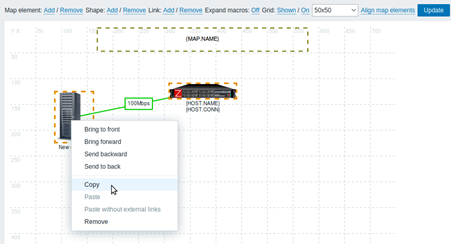
Inside the map editor, you will see a grid layout (as can be seen in the
- Add – Add a map element
- Remove – Delete elements
- Link – Connect devices
- Shapes – Draw zones or boundaries
To add a host:
- Click Add → Host
- Select the host from the list
- Choose an icon
- Place the host on the grid
Repeat this process for all of the infrastructure components. Remember to organise devices logically so that the topology reflects the real network layout.
Step 4: Connect devices using links
Once hosts are placed on the map, then connect them using links to represent physical or logical connections. To create a link:
- Click Add → Link
- Select the first host
- Select the second host
- Configure link indicators
Link indicators are important because they allow links to change colour based on trigger status. For example:
| Trigger | Link colour |
|---|---|
| Normal | Green |
| Warning | Yellow |
| Problem | Red |
If a switch fails or becomes unreachable, the link to connected devices can automatically change colour. This makes it easy to identify the source of outages visually.
Step 5: Organize infrastructure zones
Maps become easier to read when the infrastructure is grouped logically. The best way to do this is to ensure that the topology of the map mirrors the network diagram, which in turn displays a logical hierarchy for the various devices and the roles that they play.
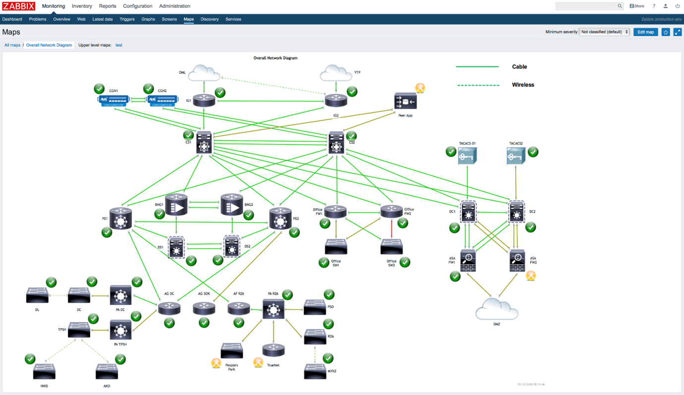
For added clarity, group related infrastructure visually. You can create visual sections using:
- Shapes
- Rectangles
- Background shading
In the example map:
- Core routers are shown in the centre, towards the top of the map
- The DMZ network is clearly segregated
- The office network is similarly ringfenced
This approach makes the map easier to understand and mirrors the real-world infrastructure, which is already well known and understood. It is not unusual to see this type of topology in hub and spoke networks e.g. where the hub is Head Office and the spokes are branches or stores. Sometimes, placing rectangular shapes around groups of equipment, such as all equipment at a particular store, is helpful to quickly identify the scope of a particular problem or issue.
Step 6: Configure dynamic icons
Dynamic icons allow Zabbix to change the icon of a device depending on trigger status. The below table shows an example:
| Status | Icon |
|---|---|
| Normal | Standard device icon |
| Warning | Orange indicator |
| Problem | Flame or red icon |
For example:
- A firewall icon may show fire when a critical alert occurs
- A server may show red when the agent is unreachable
- A PC may show a warning if a service stops
To configure this:
- Edit the map element
- Enable icon mapping
- Associate trigger severities with icons
This allows the map to function as a real-time health dashboard.
Step 7: Use Trigger-Based Labels
Another useful feature is displaying trigger information directly on the map. For example:
- “Zabbix agent is not available for 3 minutes”
- “Windows service not running”
- “Interface Gi0/1 link down”
These messages appear next to the affected device, helping engineers to immediately understand the issue. This removes the need to navigate through other dashboards or host pages. All of the above leads us to a number of best practices for designing maps with Zabbix.
Best practices for Zabbix map design
Creating a map is easy, but designing a useful monitoring map requires planning.
1. Mirror real network topology
Maps should match the real infrastructure layout. Example structure:
Firewall → Core Switch → Servers → Access switches
This helps to quickly trace faults.
2. Avoid overcrowded maps
Too many devices on a single map can reduce readability. The best approach is to:
- Create separate maps per site or function
- Use submaps for large infrastructures
3. Use consistent icons for each type of device
Maintain clear visual meaning by using recognisable icons:
- Firewalls
- Switches
- Servers
- Workstations
- Wireless devices
This consistency improves usability.
4. Use colour intelligently
A typical severity colour scheme looks like the below:
| Severity | Colour |
|---|---|
| Information | Blue |
| Warning | Yellow |
| Average | Orange |
| High | Red |
| Disaster | Dark Red |
This aligns with Zabbix's built-in trigger severity system.
5. Highlight critical infrastructure
Place important components centrally:
- Core switches
- Firewalls
- Gateway devices
Failures in these systems may affect many others.
Zabbix map design checklist
Use the checklist below when creating new monitoring maps.
PREPARATION
☐ All devices added as Zabbix hosts
☐ Monitoring templates applied
☐ Triggers configured for key alerts
MAP STRUCTURE
☐ Logical topology layout
☐ Core devices placed centrally
☐ Network zones separated visually
VISUAL DESIGN
☐ Consistent device icons
☐ Dynamic icon mapping configured
☐ Trigger labels enabled
CONNECTIVITY
☐ Links between devices configured
☐ Link indicators enabled
☐ Problem colours defined
USABILITY
☐ Map is not overcrowded
☐ Devices aligned to grid
☐ Labels readable at normal zoom
Following this checklist ensures that created maps remain clear, scalable, and operationally useful.
Benefits of network maps in Zabbix
Well-designed maps provide several operational advantages:
✔ Instant visual health overview
✔ Faster fault isolation
✔ Improved communication with non-technical teams
✔ Real-time monitoring dashboards
✔ Easier troubleshooting during outages
For small environments like a single office LAN, maps provide a simple but powerful operational dashboard. Larger environments take advantage of a hierarchy of maps that then roll up into an overall map.
Final Thoughts
Custom maps in Zabbix 7.4 transform monitoring data into a visual network representation that makes troubleshooting and infrastructure management far easier. By combining hosts, links, triggers, dynamic icons, and logical layout, you can create a real-time monitoring dashboard that clearly shows the health of your entire network. Whether you are monitoring a small office network or a large enterprise environment, investing time in building well-designed maps will greatly improve visibility and operational awareness.